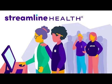
Streamline Health acquired Avelead looking to boost their mid revenue cycle software portfolio. In doing so, Streamline grew their marketing team from one to 6, and we were able to transform the appearance of their brand into the 21st century revenue cycle powerhouse that it was becoming.
As Creative Director at Streamline Health, I lead the team in overhauling the look and feel of the brand, redesigning our visual identity, video and animation styles, corporate brand materials, overhauling trade show visuals and strategy, etc. In addition, through our rebranding and content production strategy, our team was able to drive over 100 organic inbound leads in just 9 months with our new brand.
Finally! My chance to use millennial pink!
Dr. Surati approached Hi5 Practice with a newly purchased practice, a bit of inspiration, and an open mind: the perfect opportunity to create a kick-ass brand.
We began with his identity, inspired by the Beverly Hills Hotel, which demonstrates my modest hand lettering talents, and moved into design and development of his website. TheHillsDentistry.com features wall-to-wall photos (by Kerry Woo Photography) and a hip color scheme which communicates the high-end nature of his practice with a nod to the friendly and approachable character of The Hills Dentistry team. Oh! It’s also ADA compliant!
He was so inspired by the identity and website that he signed on for a (BONUS) branding package! PRINT!
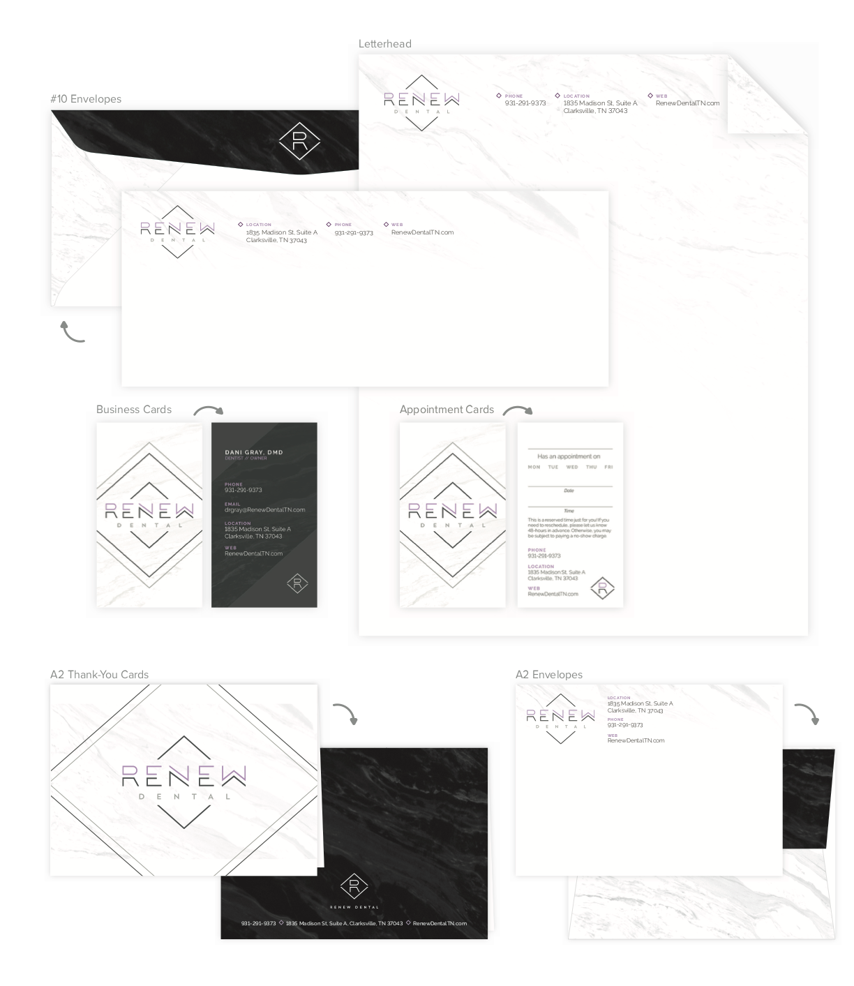
Dr. Dani Gray approached Hi5 Practice with the dream of creating a dental experience like no other—Renew Dental. Dr. Gray knows all too well the fears many experience when visiting the dentist. She wanted to create a place that was more akin to a hip restaurant or retail clothing store than a dentist. She had a logo, but she wanted to refine the concept and create a brand. My team and I transformed this into a fluid identity, she could use across various applications. This project included logo design, logo guidelines, Microsoft Word sign templates, and patient form design.
// Includes branding, website Design, print design,
The LGBT+ College Conference is one of my most exciting and rewarding personal clients. Hosted at Middle Tennessee State University, the free conference brings together hundreds of students, educators, organizers and members of the broader community to focus on the LGBT+ civil rights movement and ways of improving our cause. Three years in, the conference lacked creative direction and brand consistency. My primary goal was to create an effective identity that would solidify them as an official organization to increase participation and help them meet their sponsorship goals.
// Includes identity design, layout/print design, social media graphics, PowerPoint templates, stickers, yard signs,
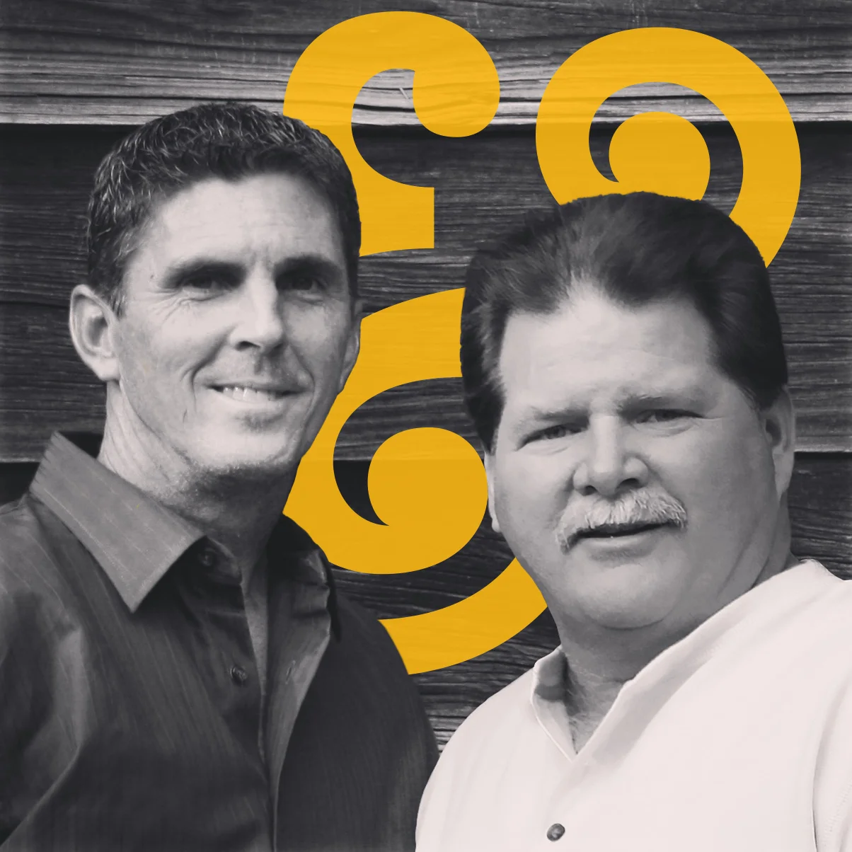
When these clients asked me for "some business cards," I wanted to give them the works. Their work ethic and unmatched standards for quality are a huge inspiration for me as a designer and a maker, so this project had to up to codes.
Meet MIKE & BUBBA, brothers (in-law) with a passion for the best and settling for nothing less. Though they're family and have a lot of laughs along the way, they won't put their name on their work if it's not their best. They can build, remodel, paint, tile, re-wire—basically, they could build a house from the ground up and furnish it. Their branding lets their work showcase itself, as well as their attitude, without being TOO terribly serious.
// includes original logo design, social media, physical brand collateral, business cards
As the sole graphic designer at Hi5 Practice, I enjoy a great deal of opportunities and creative freedom. A large part of this responsibility is executing our own branding and marketing materials. While keeping up with ~20 clients' projects, I also executed a rebranding of our company, including digital and print materials, and a new website.
Changing the name from simply "Hi5" to "Hi5 Practice" sets us apart from other general marketing firms, and puts us squarely in the category of patient retention marketing. With the mark and materials, we wanted to reflect our cutting edge approach and trustworthiness, but also that we were fun and friendly.
In addition to creating a new mark, style, print materials, and website, this undertaking involved strategy with templates and file organization to allow the team to be nimble and professional without having backgrounds in design.
// Rebranding, logo, web, print, social media, and template design
Working in collaboration with Stone + Steel Creative, I had the opportunity to create a variety of engaging pieces for the American Heart Association Nashville. Projects for AHA include simple invitations to 40+ page programs for events.
//includes large-scale print/layout design, brand extension
*Creative direction by Stone + Steel Creative